JKBOSE 9th Class Mathematics Solutions Chapter 14 Statistics
JKBOSE 9th Class Mathematics Solutions Chapter 14 Statistics
JKBOSE 9th Class Mathematics Solutions Chapter 14 Statistics
Jammu & Kashmir State Board JKBOSE 9th Class Mathematics Solutions
J&K class 9th Mathematics 14 Statistics Textbook Questions and Answers
STATISTICS AND ITS IMPORTANCE
Modern age is the age of statistics. H.G. Well’s prediction that, “Statistical thinking will one day be as necessary for efficient citizenship as the ability to read and write,” has become true. Today our culture has become a statistical culture. Every citizen finds statistics in newspapers, magazines, advertisements in T.V. and radio etc. The figures relating to the various aspects of his life-social, political and economic-represent and support the observed facts or situations. The reader analyses the figures and arrives at certain conclusions. For example, a prospective investor is interested in the profitability of the business enterprises and in its ability to meet debt obligations. He analyses the income statement and balance sheet of the enterprise for a number of years. Such analysis helps him to decide whether to invest or not.
Moreover, many have seen statistics as a device to achieve the degree of precision in the concept and theories of social science. In nut shell, if we analyse the way in which statistics is looked at, we broadly find two categories, one refers statistics as a set of figures and the other connotes it as a set of techniques.
1. Derivation of the Term Statistics. The word statistics has been derived from the Latin word “status” or the Italian world “Statista”. Both the words mean a ‘Political State’. In the early years, “Statistics” meant a collection of facts about the state or the people in the state for political purposes. Thus it helped in collecting data about economic and social conditions of people living in different parts of the country. For proper functioning of the State, it is essential to know the conditions under which the people live and work, earn income and spend their wealth. This science was known as science of the state because it was used by the State. In this way, statistics developed as a “King’s Subject” or as a ‘Science of Kings’ or Political Arithmetic.
But with the passage of time, the scope of statistics widened. For some time, Statistics was regarded as a branch of Economics but now it has become a fulfledged independent subject. In the present times,
Statistics is not only science of the state but it also includes in all types of quantitative analysis. Sir R.A. Fisher regards the science of Statistics as “Mathematics to observational data.” The modern concept of statistics was evolved in 1749.
According to Oxford Dictionary
Statistics has two meanings as in :
(i) plural sense
(ii) singular sense.
(i) In plural sense, statistics means numerical statements of facts capable of some meaningful analysis and interpretation.
Features of Statistics in Plural sense. The basic features of statistics as a quantitative or numerical data runs as follows :
(1) Statistics does not refer to a single figure but it refers to a series of figures.
(2) Statistics are not affected by one factor only, rather they are affected by a large number of factors e.g. prices are affected by conditions of demand, supply, money supply, imports, exports and various other factors.
(3) Anothor characteristic of statistics is that qualitative expression like young, old, good, bad etc. are not statistics.
(4) In case the numerical statements are precise and accurate then these can be enumerated. But in case the number of observations is large, in that case figures are estimated.
(5) For reasonable standard of accuracy, the data should be collected in a systematic manner, otherwise the results would be erroneous.
(6) The usefulness of the data collected would be negligible if the data is not collected with some predetermined purpose.
(7) Collection of data is generally done with the motive to compare. So figures collected should be homogeneous for comparison and not heterogeneous.
e.g. it does not make any sense if we compare the height of a person and rent he pays for accommodation.
Thus, it is clear that without aforesaid characteristics, the numerical data can not be called statistics.
If implies, “all statistics are numerical statements of facts but all numerical statements of facts are not statistics.
(ii) Statistics in Singular Sense. In singular sense, statistics implies statistical method. Thus, it is a body or technique of methods relating to the collection, classification, presentation, analysis and interpretation of information.
Data. Statistical data are a numerical statement of aggregates. Data, generally, are obtained through properly organised statistical inquiries conducted by investigators. Data can either be from primary or secondary sources.
Primary Data. Primary data are the data originally collected for an investigation. This type of data are original in character because these are collected by field workers, enumerators, investigators for the first time for their own use. For instance, data obtained in a population census by the office of the Register General, census commissioner, Ministry of Home Affairs are termed as primary data.
Methods of collecting Primary Data.
(i) Direct Personal Investigation
(ii) Indirect Personal Investigation test
(iii) Questionnaire Method
(iv) Questionnaire sent through post
(v) Schedules sent through Enumerators.
Secondary Data. Secondary data are those which are collected from published or unpublished sources. Such data are also known as the second hand data.
Moreover, secondary data are usually, in the shape of finished products since they have been treated statistically in some form or the other. Data published by CSO, Economic Surveys, RBI Bulletins are the instances of secondary data.
Collection of Secondary Data. The secondary sources can be classified into two categories viz., published and unpublished sources.
(A) Published sources of secondary data are :
(1) Official publications of central and state governments
(2) Internal publications
(3) Semi Govt. Publications
(4) Reports of Committees and Commissions
(5) Private Publications
(6) Newspapers and Magazines
(7) Research Scholars.
(B) Unpublished source of secondary data. When data are collected by someone but which are not published and are taken by other persons for his investigation, they are known as Unpublished Secondary Data e.g. reports of trade unions, cooperative societies reports prepared by private investigation companies etc.
TEXT BOOK EXERCISE – 14.1
Q. 1. Give some examples of data that you can collect from your day to day life.
Ans.— Some examples of data that we can gather from our day to day life are :
(i) Number of students in our class.
(ii) Number of fans in our school.
(iii) Electricity bills of our house for last two years.
(iv) Election results obtained from television or newspapers
(v) Literacy rate figures obtained from Educational Survey.
(vi) Heights of 20 students of your class.
(vii) Maximum temperatures of the days of a particular week from television.
(viii) Number of members in the families of your locality from a record.
(ix) Distances from the school of the homes of ten students. Of course, remember that there can be many more different answers.
Q. 2. Classify the data in Q. 1 above as primary or secondary data.
Ans.— Primary data. When the information was collected by the investigator herself or himself with a definite objective in her or his mind, the data obtained is called Primary data. This type of data are original in character and collected for the first time for their own use. ad Above mentioned (i), (ii), (iii), (vi) and (ix) are the examples of primary data.
Secondary data. When the information was gathered from a source (like newspaper, television or some records) which already had the information stored is called Secondary data. Such data has been collected by someone else in another context needs to be used with great care. These data are collected for a purpose other than that of original investigator. Above mentioned, (iv), (v), (vii) and (viii) are the examples of secondary data.
Remark :
Primary data are more reliable than secondary data because in primary data ; all details are collected relevant to the investigator’s study.
Presentation of Data. As soon as the work related to collection of data is over, the investigator has to find ways to condense them in a form which is meaningful, easily understandable and gives its salient features at a glance. So, we need to find out ways to present our data in an appropriate form. Let us define the various types of data and ways of presenting the data.
1. Raw Data. When the investigator has collected the data and he has not arranged the same in a systematic manner it is called raw data or unorganised data.
Arraying of the Data. When the individual units are arranged in ascending or descending order then it is called as arraying of the data. This presentation though better than the raw data, does not reduce the volume of the data.
Range. The difference between the highest and the lowest values of the observations in given data is called the range.
Formulation of Frequency Distribution. A frequency distribution shows the frequency of occurrence of different values of a single phenomenon.
When the number of observations is large, we make use of tally marks to count the frequencies. Tallies are usually marked in bunches of five for ease of counting.
Frequency distribution is constructed for the following reasons :
(a) to facilitate the analysis of data.
(b) to facilitate calculation of different statistical measures.
II. Ungrouped Data (Discrete Series). In such type of data the variable refers to that characteristics which can not be expressed in fractions or it is a fractionless variable. There will be either one employee or two.
There cannot be 1 – 1/2 employee. The number of times each quantity or amount occurs, are shown in front of each quantity or amount which are known as frequencies.
Grouped Data (Continuous Series). In such type of data the variable refers to that characteristics which can assume any conceivable fractional value within a range of possibilities such as the income, weight, profit, length etc.
Example
| Daily Income (₹) | 0-100 | 100-200 | 200-300 | 300-400 | 400-500 |
| No. of Persons | 15 | 7 | 25 | 10 | 6 |
Class
Each stated interval such as 0-100, 100-200 etc. is called a class.
Class Limits. There are two limits of every class. The lower value of a class is called the lower limit and upper value of that, class is called the upper limit of that class e.g. in the (0-100) group. Zero is the lower limit and 100 is the upper limit.
Class Interval. Difference between the upper limit U and lower limit L of a class is know as class-interval.
i = U – L
Example. In the (0 – 100) group or class
i = 100 – 200) groups
Mid values or class Marks or Class Mid-point. The value lying exactly in the middle or centre of the two class limits of a group or class is know as mid value or mid-point.
So, it is the average of two limits of the class. The mid values can be calculated by adding the two limits and dividing it by two.
In symbols,
Classmark = U + L/2
Example. In the (100 – 200) groups
Class mark = 200 + 100/2
= 300/2
= 1450
Class Frequency. The number of observations corresponding to a particular class is known as the frequency of that class or class frequency. It is denoted generally by f. The sum of frequencies is denoted by ∑f or N.
Types of Grouped Data. The grouped data (or Continuous serise) are mainly of following types.
(1) Inclusive series
(2) Exclusive series
(3) Cumulative frequency distribution
(4) Equal class interval series.
In inclusive series upper limit of a class is less than lower limit of next class when classes are arranged in ascending order. In this type, overlapping of class intervals is avoided. Both the upper and lower limits are included in the class interval e.g.
| Wage | 10 – 19 | 20 – 19 | 30 – 39 | 40 – 49 |
| Numbers of Workers (frequency) | 5 | 10 | 12 | 13 |
In the above series, values 19, 29, 39 and 49 will be included in the same classes in which they are written. This method ignores continuity in the class intervals.
However, fractional values between 19 and 20, 29 and 30, 39 and 40 cannot be accounted in such a classification.
In Exclusive series an item whose value coincides with the upper limit of a class is excluded from that class and is included in the next class that has an equivalent lower limit.
e.g.
| Wage | 10 – 20 | 20 – 30 | 30 – 40 | 40 – 50 |
| Number of Workers (frequency) | 5 | 10 | 12 | 13 |
Now upper limit 20 (or Ist class interval) is considered as slightly less than 20, i.e. (19.999……..00) and any value equal to 20 shall not be included in this class, but in the next class, which has a lower limit 20. Similar is the case with other classes. This method assumes continuity in the class interval because the upper limit of one class is the lower limit of the next class.
Conversion of Inclusive Series into Exclusive Series. Inclusive series may be converted into exclusive series by applying the “Correction Factor” to be lower and upper limits.
Where Correction factor (d)
{Value of the lower limit of class} – {Value of the upper limit of Pereceding class) d = / 2
To convert inclusive series into ex exclusive series, d is subtracted from all the lower limits and is added to all the e upper limits e.g.,
Inclusive Series
| X | 10 – 19 | 20 – 29 | 30 – 39 | 40 – 49 |
| f | 5 | 3 | 2 | 1 |
In the above inclusive series the correction factor d is :
d = 20 – 19/2
= 30 – 29/2
= 40 – 39/2
= 1/2 = 0.5
The new exclusive series will be
| Lower limit – d | Upper limit + d | Class Boundaries | f |
| 10 – 0.5 = 9.5 | 19 + 0.5 = 19.5 | 9.5 – 19.5 | 5 |
| 20 – 0.5 = 19.5 | 29 + 0.5 = 29.5 | 19.5 – 29.5 | 3 |
| 30 – 0.5 = 29.5 | 39 + 0.5 = 39.5 | 29.5 – 39.5 | 2 |
| 40 – 0.5 = 39.5 | 49 + 0.5 = 49.5 | 39.5 – 49.5 | 1 |
Equal and Unequal Class-Interval Series.
(a) Equal Class-Interval Series. When the classes in a series are of the same interval (width), it is called the equal interval series.
(b) Unequal Class-interval Series. When the classes in a series are not of the same width, it is called the unequal interval series.
TEXT BOOK EXERCISE – 14.2
1. The blood groups of 30 students of a class VIII are recorded as follows :
A, B, O, O, AB, O, A, O, B, A, O, B, A, O, O, A, AB, O, A, A, O, O, AB, B, A, O, B, A, B, O
Represent this data in the form of a frequency distribution table. box Which is the most common and which is the rarest blood group pecamong these students ?
Solution.— The frequency distribution table for the given data is as follows :
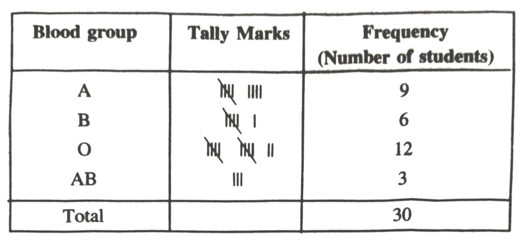
From the table we observe that most common blood groups is and the rarest group is AB.
2. Distance (in km) of 40 engineers from their place of residence to their place of work were found follows
| 5 | 3 | 10 | 20 | 25 | 11 | 13 | 7 | 12 | 31 |
| 19 | 10 | 12 | 17 | 18 | 11 | 32 | 17 | 16 | 2 |
| 7 | 9 | 7 | 8 | 3 | 5 | 12 | 15 | 18 | 3 |
| 12 | 14 | 2 | 9 | 6 | 15 | 15 | 7 | 6 | 12 |
Construct a grouped frequency distribution table with class size 5 for the data given above taking the first interval as 0-5 (5 not included). What main features do you observe from this tabular representation ?
Solution.— The grouped frequency distribution table for the given data is as follows :
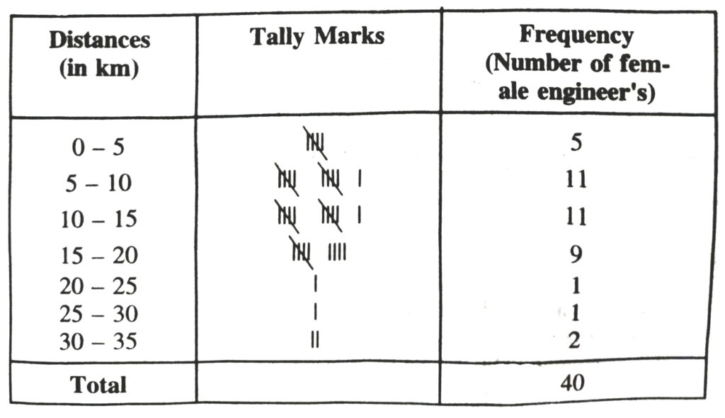
From the table we observe that out of 40 female engineers 36 (5 + 11 + 11 + 9) engineers i.e. 90% of the total female engineers reside less than 20 km from their place of work.
3. The relative humidity (in %) of a certain city for a month of 30 days was as follows :
| 98.1 | 98.6 | 99.2 | 90.3 | 86.5 | 95.3 | 92.9 | 96.3 |
| 94.2 | 95.1 | 89.2 | 92.3 | 97.1 | 93.5 | 92.7 | 95.1 |
| 97.2 | 93.3 | 95.2 | 97.3 | 96.2 | 92.1 | 84.9 | 90.2 |
| 95.7 | 98.3 | 97.3 | 96.1 | 92.1 | 89 |
(i) Construct a grouped frequency distribution table with classes 84-86, 86-88 etc.
(ii) Which month or season do you think this data is about ?
(iii) What is the range of this data ?
Solution.— (i) The grouped frequency distribution table the given data is as follows :
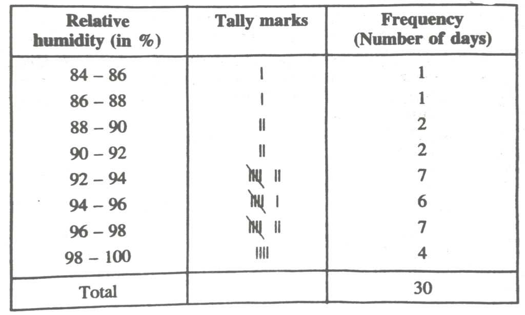
(ii) From the data we observe that relative humidity is high. So data appears to be taken in the rainy season.
(iii) From the data we observe that
Highest relative humidity = 99.2%
Lowest relative humidity = 84.9%
Range = (99.2 – 84.9) %
= 14.3%
4. The heights of 50 students, measured to the nearest centimetres have been found to be as follows :
| 161 | 150 | 154 | 165 | 168 | 161 | 154 | 162 | 150 | 151 |
| 162 | 164 | 171 | 165 | 158 | 154 | 156 | 172 | 160 | 170 |
| 153 | 159 | 161 | 170 | 162 | 165 | 166 | 168 | 165 | 164 |
| 154 | 152 | 153 | 156 | 158 | 162 | 160 | 161 | 173 | 166 |
| 161 | 159 | 162 | 167 | 168 | 159 | 158 | 153 | 154 | 159 |
(i) Represent the data given above by a grouped frequency distribution table, taking the class-intervals as 160 – 165, 165 – 170 etc.
(ii) What can you conclude about their heights from the table ?
Solution.— (i) Grouped frequency distribution of given data is as follows :
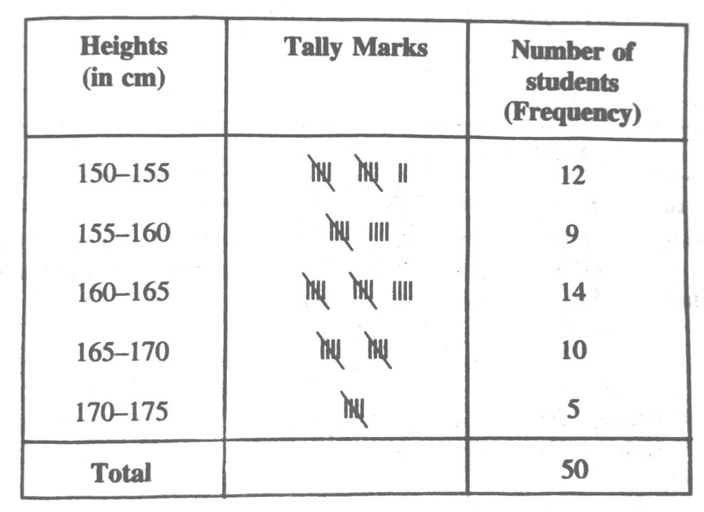
(ii) From the frequency distribution table drawn above; we conclude that more than 50% of the students are shorter than 165 cm.
5. A study was conducted to find out the concentration of sulphur dioxide in the air in parts per million (ppm) of a certain city. The data obtained for 30 days is as follows :
| 0.03 | 0.08 | 0.08 | 0.09 | 0.04 | 0.17 | 0.16 | 0.05 | 0.02 |
| 0.06 | 0.18 | 0.20 | 0.11 | 0.08 | 0.12 | 0.13 | 0.22 | 0.07 |
| 0.08 | 0.01 | 0.10 | 0.06 | 0.09 | 0.18 | 0.11 | 0.07 | 0.05 |
| 0.07 | 0.01 | 0.04 |
(i) Make a grouped frequency distribution table for this data with class intervals as 0.00 – 0.04, – 0.04 – 0.08 and so on.
(ii) For how many days, was the concentration of sulphur dioxide more than 0.11 parts per million.
Solution.— (i) Frequency distribution table for the given data is as follows :
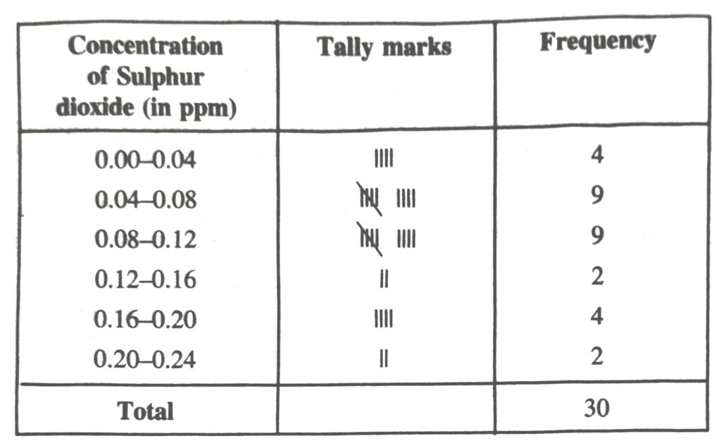
(ii) From the frequency distribution table we observe that the concentration of Sulphur dioxide was more than 0.11 ppm for 8 days.
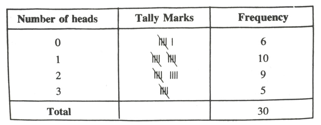
6. Three coins were tossed 30 times simultaneously. Each time the number of heads occurring was noted down as follows :
| 0 | 1 | 2 | 2 | 1 | 2 | 3 | 1 | 3 | 0 |
| 1 | 3 | 1 | 1 | 2 | 2 | 0 | 1 | 2 | 1 |
| 3 | 0 | 0 | 1 | 1 | 2 | 3 | 2 | 2 | 0 |
Prepare a frequency distribution for the data given above.
Solution.— The frequency distribution table for the given data is as follows :
7. The value of upto 50 decimal places is given below :
| 3.1415926535 | 8979323846 | 2643383279 | 5028841971 | 6939937510 |
(a) Make a frequency distribution of the digits after the decimal point list the digits from 0 to 9 in your first column.
(b) What are the most and the least frequency occurring digits ?
Solution.— (a) The value of upto 50 decimal places is given as table :
π = 3.1415926535, 8979323846, 2643383279, 5028841971, 6939937510
The frequency distribution table of the digits after the decimal point in the value of л is as follows :
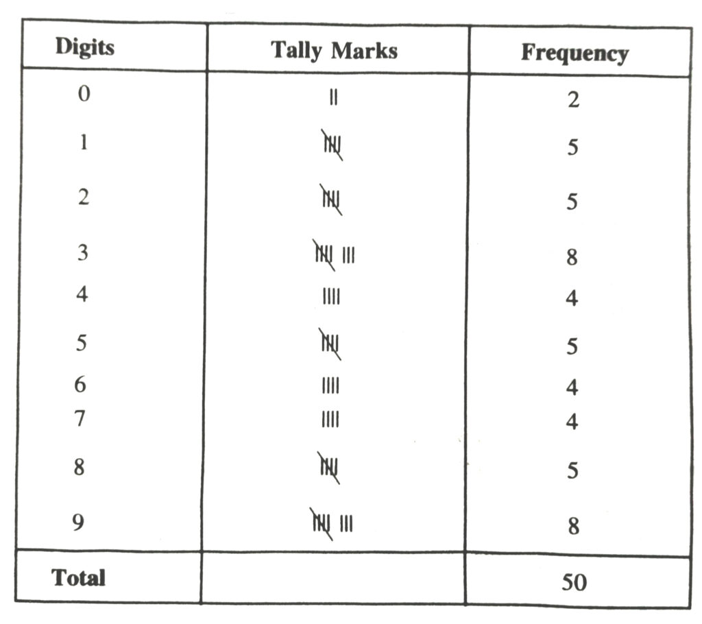
(b) Maximum frequency is 8
Hence 3 is the most frequently occuring digit.
Least frequency is 2.
Hence 0 is the least occuring digit.
8. Thirty children were asked about the number of hours they watched TV programmes in the previous week. The results were found as follows :
1, 6, 2, 3, 5, 12, 5, 8, 4, 8, 10, 3, 4, 12, 2
8, 15, 1, 17, 6, 3, 2, 8, 5, 9, 6, 8, 7, 14, 12
(i) Make a frequency distribution table for this data, taking class width 5 and one of the class interval as 5-10
(ii) How many children watched television for 15 or more hours a week ?
Solution.— (i) Frequency distribution table for the given data is as follows :
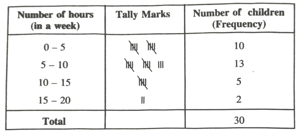
(ii) From the frequency table we observe that number of children in the class interval 15-20 is 2.
So 2 children view television for 15 hours or more than 15 hours a week.
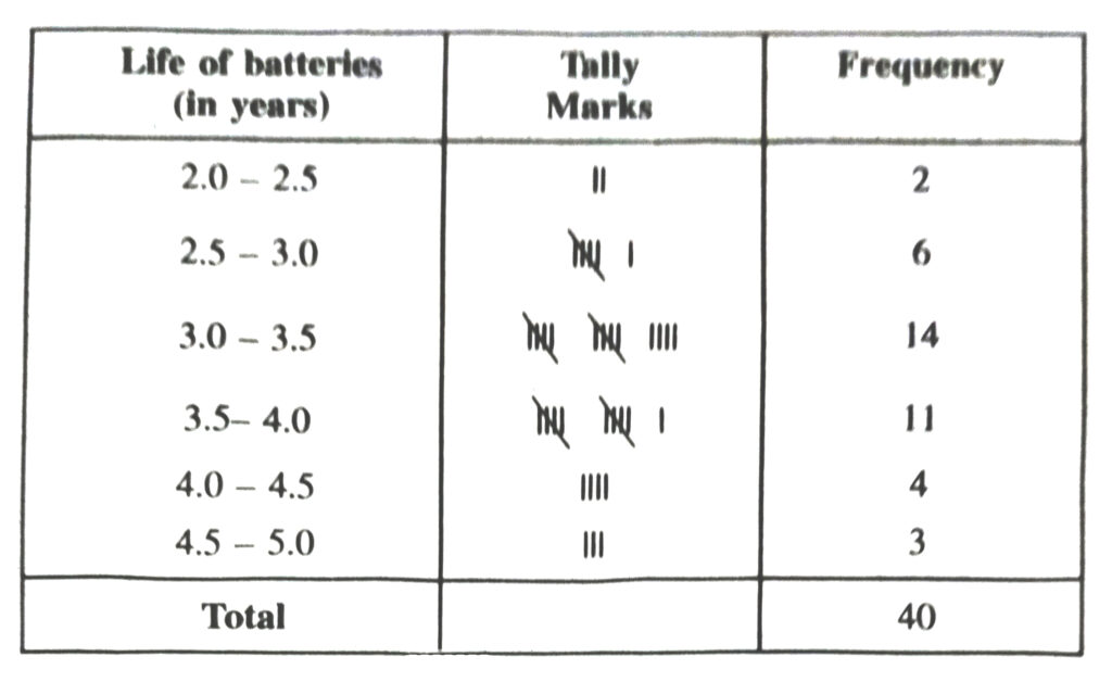
9. A company manufactures car-batteries of particular type. The lives (in years) of 40 such batteries were recorded as follows :
2.6, 3.0, 3.7, 3.2, 2.2, 4.1, 3.5, 4.5, 3.5, 2.3, 3.2, 3.4, 3.8, 3.2, 4.6, 3.7, 2.5, 4.4, 3.4, ,3.3, ,2.9, 3.0, 4.3, 2.8, 3.5, 3.2, 3.9, 3.2, 3.2, 3.1, 3.7, 3.4, 4.6, 3.8, 3.2, 2.6, 3.5, 4.2, 2.9, 3.6
Construct a grouped frequency distribution table for this data, using class intervals of size 0.5 starting from the interval 2-2.5.
Solution.— Grouped frequency distribution of the given data is as follows :
GRAPHICAL REPRESENTATION OF
STATISTICAL DATA
We started with raw data and brought out their salient features by grouping them into frequency tables. Frequently, we get a better perspective of data by representing them pictorially. The pictorial representations are eye-catching and leave a deeper and more lasting impression on the mind of the observer. Of course, the pictorial representations should be properly titled and labelled so as to convery to the reader what they are about.
Bar graph :
Bar graph is a graphical representation when the frequency distribution is ungrouped or the classes are non-continuous for grouped frequency distribution.
Histogram
Histogram is the graphical representation of frequency distribution of a continuous variables. In the construction of histogram, class interval of continuous data is taken on x-axis and rectangle of appropriate height such that height of the histogram is equal to the frequency of that class interval are erected over them,
∴ Height of rectangle = Frequency
Unlike Bar graph, here width of the bar plays a significant role in its construction.
Here, lengths of the rectangles erected are proportional to the frequencies and the width of the rectangles are proportional to the frequencies. Since, the widths of the rectangles are all equal the areas of the rectangles are proportional to the frequencies.
To Construct histogram when widths or class intervals are not equal.
As we have mentioned earlier area of the rectangles are proportional to the frequencies in a histogram. Earlier this problem did not arise because widths of all the rectangles were equal, but here since the widths of the rectangles are varying, the histogram above does not give a correct picture.
We needs to make certain adjustments in the heights of the rectangles so that the area is again proportional to height.
Frequency Polygon
Frequency Polygon is obtained by joining the mid-points of the respective tops of the rectangles in a histogram. To complete the polygon, the mid-points at each end are joined to the immediately lower or higher mid-point (as the case may be at zero frequency.)
Remarks :
1. If only frequency polygon is to be drawn, first represent the class-marks on the x-axis and corresponding frequencies on y-axis, Plot the corresponding points and join them by the line segments.
2. While drawing a graph, is to put kink denoted by __on that axis on which markings do not begin with zero and are started from some other desired point.
TEXT BOOK EXERCISE – 14.3
1. A survey conducted by an organisation for the cause of illness and death among the women between the ages 15 – 44 (in years) worldwide, found the following figures (in %)
| Sr. No. | Causes | Female fatality rate (%) |
| 1. | Reproductive health conditions | 31.8 |
| 2. | Neuropsychiatric conditions | 25.4 |
| 3. | Injuries | 12.4 |
| 4. | Cardiovascular conditions | 4.3 |
| 5. | Respiratory conditions | 4.1 |
| 6. | Other causes | 22.0 |
(i) Represent the information given above graphically.
(ii) Which condition is the major cause of women’s ill health and death worldwide ?
(iii) Try to find out, with the help of your teacher, any two factors which play a major role in the case (ii) above being the major cause.
Solution.— (i) We represent the given information in the form of a bargraph. We construct the bar diagram through the following steps :
Step 1. Draw two perpendicular axes OX and OY on a plain paper.
Step 2. Along OX mark “Causes” and along OY “Female Fertility rate (%)”.
Step 3. Along OX, choose suitable width for each bar.
Step 4. Along OY, choose an appropriate scale and mark the Female Fertility rate (%).
Scale Chosen :
On y – axis ;
1 large division
i.e. 1 cm = 5%
Bar graph showing the cause of illness
and death among women between the
ages 15-44 (in years) worldwide
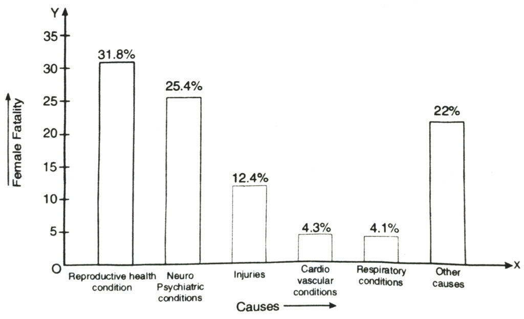
(ii) From the bar graph we observe that reproductive health conditions is the major cause of woman illness and death worldwide.
(iii) Two major factors for poor sexual and reproductive health conditions are as follows :
(1) Lack of awareness among women.
(2) Lack of medical facilities.
2. The following data on the number of girls (to the nearest ten) per thousand boys in different sections of Indian Society is given below :
| Section | Number of girls per thousand boys |
| Scheduled Caste | 940 |
| Scheduled Tribes | 970 |
| Non SC/ST | 920 |
| Backward districts | 950 |
| Non-backward districts | 920 |
| Rural | 930 |
| Urban | 910 |
(i) Represent the information above by a bar graph.
(ii) In the class-room discuss what conclusions can be arrived at from the graph.
Solution.— (i) We represent the given information in the form of a bargraph. We construct the bar diagram through the following steps :
Step 1. Draw two perpendicular axes OX and OY on a plain paper.
Step 2. Along OX mark “Section” and along OY mark “Number of girls per thousand boys.”
Step 3. Along OX choose suitable width for each bar.
Step 4. Along OY choose an appropriate scale. Here choose 1 large division 100 girls. =
Step 5. Calculate the heights of the various bars as follows:
(i) Height of bar for scheduled caste = 1/100 × 940 = 9.4 large divisions =
(ii) Height of bar for scheduled tribe = 1/100 × 970 = 9.7 large divisions
(iii) Height of bar for Non SC/ST = 1/100 × 920 = 9.2 large divisions
(iv) Height of bar for Backward districts = 1/100 × 950 = 9.5 large divisions
(v) Height of bar for non-backward districts = 1/100 × 920 = 9.2 large division
(vi) Height of bar for Rural = 1/100 × 930 = 9.3 large divisions
(vii) Height of bar for Urban = 1/100 × 910 = 9.1 large divisions
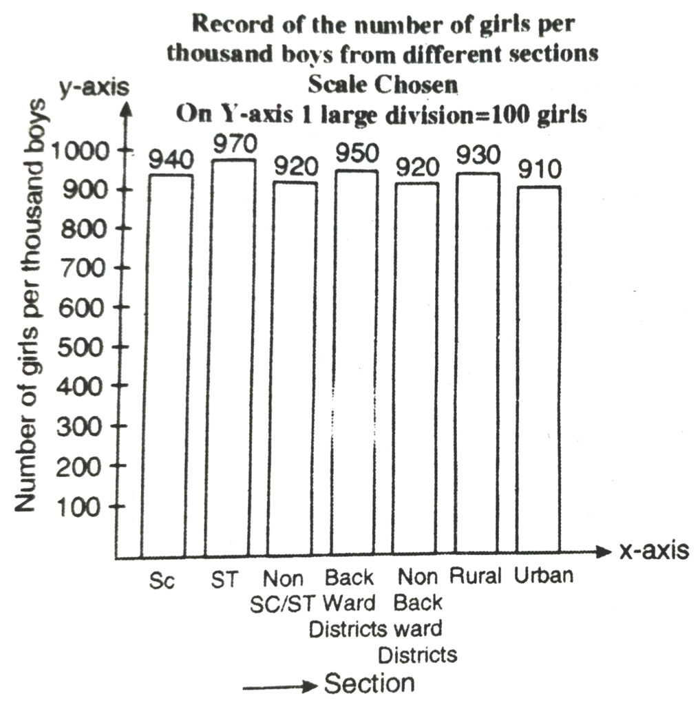
(i) From the graph we observe that in each section the number of girls are nearly same. We also observe that the number of girls in each section are less than the boys.
3. Given below are the seats won by different political parties in the polling outcome of a state assembly elections :
| Political Parties | A | B | C | D | E | F |
| Seats Won | 75 | 55 | 37 | 29 | 10 | 37 |
(i) Draw a bar graph to represent the polling results.
(ii) Which political party won the maximum number of seats.
Solution.— (i) We respresent the given information in the form of a bar graph which is drawn as follows :
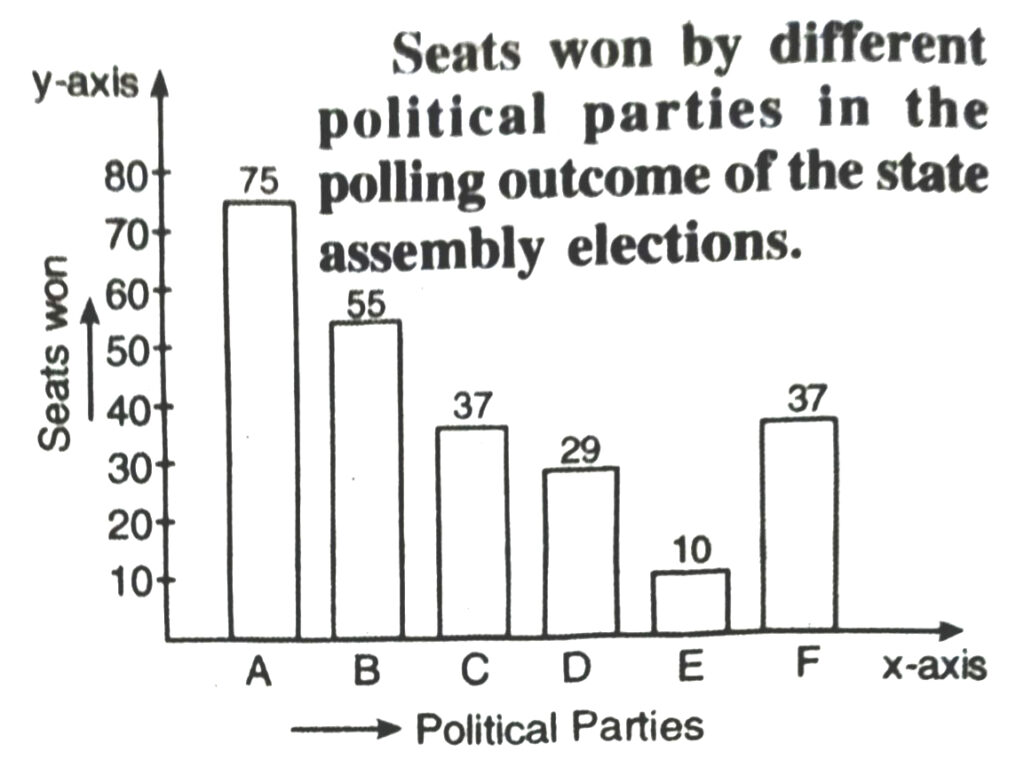
Scale Chosen : On y-axis : 1 large division i.e. 1 cm = 10 seats
(ii) Out of all won seats ; 75 is the maximum.
So, party A has won maximum number of seats.
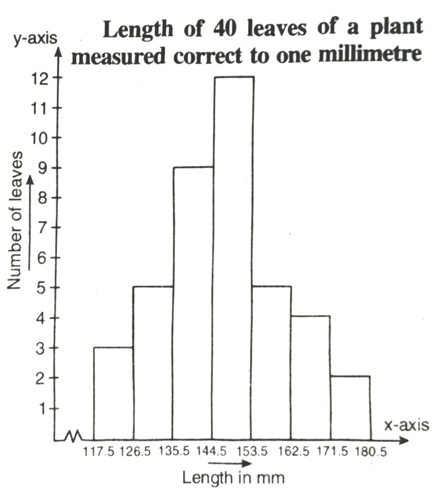
4. The length of 40 leaves of a plant are measured correct to one millimetre, and the obtained data respresented in the following table
| Length (in mm) | Number of leaves |
| 118-126 | 3 |
| 127-135 | 5 |
| 136-144 | 9 |
| 145-153 | 12 |
| 154-162 | 5 |
| 163-171 | 4 |
| 172-180 | 2 |
(i) Draw a histogram to represent the given data.
(ii) Is there any other suitable graphical representation for the same data ?
(iii) Is it correct to conclude that the maximum number of leaves are 153 mm long ? Why ?
Solution.— (i) We first make the distribution continuous (i.e. inclusive to exclusive form) as given below :
Let us find half the difference between the lower limit of a class and upper limit of its proceeding class i.e. (127 – 126) = 1/2 = 0.5
Now to make distribution continuous; in each of the class.
We subtract 0.5 from the lower limit and add 0.5 to the upper limit.
Thus we get the distribution as follows :
| Length (in mm) | Number of leaves |
| 117.5-126.5 | 3 |
| 126.5-135.5 | 5 |
| 135.5-144.5 | 9 |
| 144.5-153.5 | 12 |
| 153.5-162.5 | 5 |
| 162.5-171.5 | 4 |
| 171.5-180.5 | 2 |
We represent the given data in the form of a histrogram which is as follows :
Scale Chosen : On y-axis 1 large division i.e. 1 cm = 1 leave
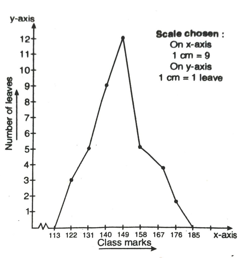
(ii) Yes we can represent the given data by other graphical representation named as Frequency Polygon which is as follows :
First of all we prepare a table with class-marks and corresponding number of leaves.
| Length (in mm) | Class mark | Number of leaves |
| 117.5-126.5 | 122 | 3 |
| 126.5-135.5 | 131 | 5 |
| 135.5-144.5 | 140 | 9 |
| 144.5-153.5 | 149 | 12 |
| 153.5-162.5 | 158 | 5 |
| 162.5-171.5 | 167 | 4 |
| 171.5-180.5 | 176 | 2 |
We plot the class-marks on x-axis and number leaves on y-axis
We plot the ordered pairs (122, 3), (131, 5) ………… (176, 2)
Join them by line-segments to get the frequency polygon.
(iii) No, because the maximum number 12 is corresponding to the class interval 145 – 153 which implies that the leaves whose length are 145 mm or less than 153 mm are maximum in number.
Q. 5. The following table gives the life times of 400 neon lamps :
| Lifetime (in hours) | Number of lamps |
| 300-400 | 14 |
| 400-500 | 56 |
| 500-600 | 60 |
| 600-700 | 86 |
| 700-800 | 74 |
| 800-900 | 62 |
| 900-1000 | 48 |
(i) Represent the given information with the help of a histogram.
(ii) How many lamps have a life time of more than 700 hours ?
Solution.— (i) We represent the given information in the form of histograms which is as follows :
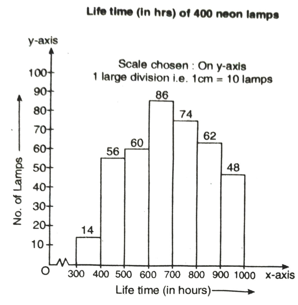
(ii) Number of lamps having lifetime of more than 700 hours = 74 + 62 + 48 = 184
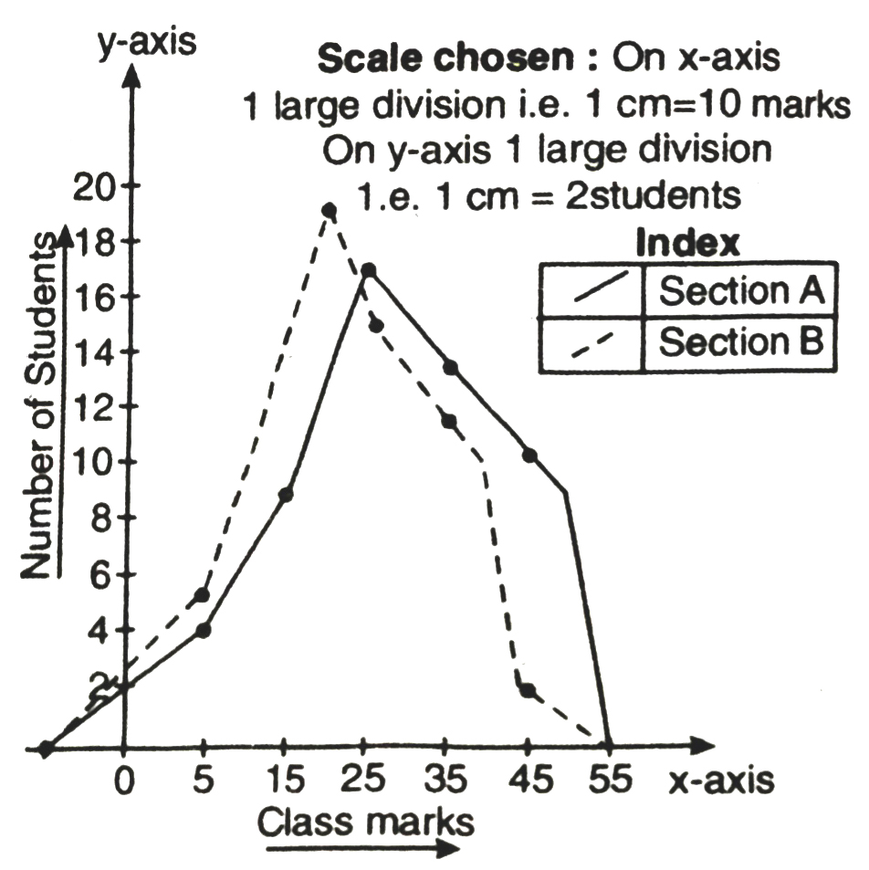
Q. 6. The following table gives the distribution of students of two sections according to the marks obtained by them:
| Section A | Section B |
| Marks | Frequency | Marks | Frequency |
| 0-10 | 3 | 0-10 | 5 |
| 10-20 | 9 | 10-20 | 19 |
| 20-30 | 17 | 20-30 | 15 |
| 30-40 | 12 | 30-40 | 10 |
| 40-50 | 9 | 40-50 | 1 |
(a) Represent the marks of the students of both the sections on the same graph by two frequency polygons. From the two polygons compare the performance of the two sections.
Solution.— We represent the given information in the form of frequency polygon.
So, we prepare a table with class-marks and corresponding number of students of sections A and B.
| Marks obtained | Class-marks | Number of students in Section A | Number of students in Section B |
| 0-10 | 5 | 3 | 5 |
| 10-20 | 15 | 9 | 19 |
| 20-30 | 25 | 17 | 15 |
| 30-40 | 35 | 12 | 10 |
| 40-50 | 45 | 9 | 1 |
We plot the class-marks on x-axis and number of students on y-axis.
We plot the ordered pairs (5, 3), (15, 9), (25, 17), (35, 12) and (45, 9). Join them by line-segment to get the frequency polygon for section A.
We plot the ordered pairs (5, 5), (15, 19), (25, 15), (35, 10) and (45, 1).
Join these by dotted line-segment to get the frequency polygon for section B.
From the graph we observe that Students of section A performed better; because as we move right on x-axis the number of students are spread widely over greater marks as compared to the students of section A.
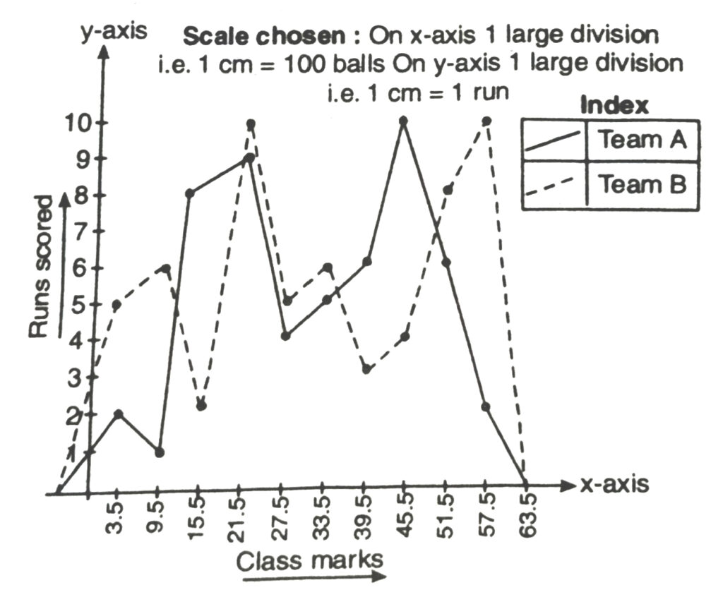
Q. 7. The runs scored by two teams A and B in the first 60 balls in a cricket match are given ahead :
| Number of balls | Team A | Team B |
| 1-16 | 2 | 5 |
| 7-12 | 1 | 6 |
| 13-18 | 8 | 2 |
| 19-24 | 9 | 10 |
| 25-30 | 4 | 5 |
| 31-36 | 5 | 6 |
| 37-42 | 6 | 3 |
| 43-48 | 10 | 4 |
| 49-54 | 6 | 8 |
| 55-60 | 2 | 10 |
Represent the data of both the teams on the same graph by frequency polygons.
Solution.— We represent the given information in form of frequency polygon.
We first make the class intervals continuous, then find the class marks.
Correction factor,
d = value of lower limit of a class – value of upper limit of preceding class/2
⇒ d = 7 – 6/2 = 1/2 = 0.5
New exclusive series is as follows :
| Lower limit – d | Upper limit + d | Class boundaries |
| 1 – 0.5 = 0.5 | 6 + 0.5 = 6.5 | 0.5-6.5 |
| 7 – 0.5 = 6.5 | 12 + 0.5 = 12.5 | 6.5-12.5 |
| 13 – 0.5 = 12.5 | 18 + 0.5 = 18.5 | 12.5-18.5 |
| 19 – 0.5 = 18.5 | 24 + 0.5 = 24.5 | 18.5-24.5 |
| 25 – 0.5 = 24.5 | 30 + 0.5 = 30.5 | 24.5-30.5 |
| 31 – 0.5 = 30.05 | 36 + 0.5 = 36.5 | 30.5-36.5 |
| 37 – 0.5 = 36.5 | 42 + 0.5 = 42.5 | 36.5-42.5 |
| 43 – 0.5 = 42.5 | 48 + 0.5 = 48.5 | 42.5-48.5 |
| 49 – 0.5 = 48.5 | 54 + 0.5 = 54.5 | 48.5-54.5 |
| 55 – 0.5 = 54.5 | 60 + 0.5 = 60.5 | 54.5-60.5 |
| Number of balls | Class-marks | Runs scored by team A | Runs scored by team B |
| 0.5-6.5 | 3.5 | 2 | 5 |
| 6.5-12.5 | 9.5 | 1 | 6 |
| 12.5-18.5 | 15.5 | 8 | 2 |
| 18.5-24.5 | 21.5 | 9 | 10 |
| 24.5-30.5 | 27.5 | 4 | 5 |
| 30.5-36.5 | 33.5 | 5 | 6 |
| 36.5-42.5 | 39.5 | 6 | 3 |
| 42.5-48.5 | 45.5 | 10 | 4 |
| 48.5-54.5 | 51.5 | 6 | 8 |
| 54.5-60.5 | 57.5 | 2 | 10 |
We plot the class-marks on x-axis and number of students on y-axis.
We plot ordered pairs (3.5, 2), (9.5, 1) ……….(57.5, 2).
Join them by a line segment toate the frequency polygon for team A.
We plot the ordered pairs (3.5, 5), (9.5, 6) ……. (57.5, 10) them by a dotted line-segment to get the frequency polygon for team B.
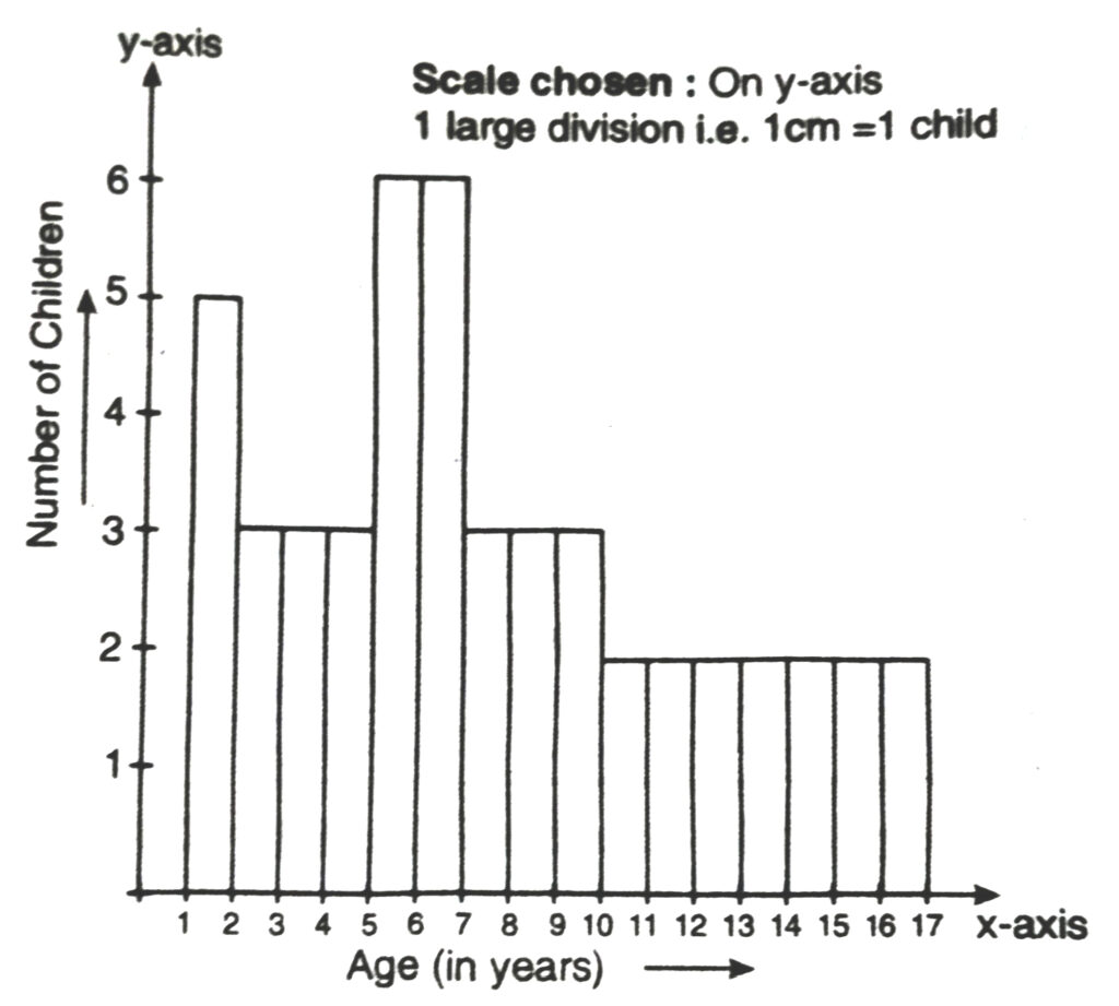
Q. 8. A random survey of the number of children of various park was found as follows :
| Age (years) | Number of Children |
| 1-2 | 5 |
| 2-3 | 3 |
| 3-5 | 6 |
| 5-7 | 12 |
| 7-10 | 9 |
| 10-15 | 10 |
| 15-17 | 4 |
Draw a histogram to represent the data above.
Solution.— Here classes are not of equal size. We select the class with minimum class size. Here minimum class size is 1.
Adjustment of frequencies (height of rectangles) according to the class size are as follows :
| Age (in years) | Frequency | Width | Length of rectangle |
| 1-2 | 5 | 1 | 5/1 × 1 = 5 |
| 2-3 | 3 | 1 | 3/1 × 1 = 3 |
| 3-5 | 6 | 2 | 6/2 × 1 = 3 |
| 5-7 | 12 | 2 | 12/2 × 1 = 6 |
| 7-10 | 9 | 3 | 9/3 × 1 = 3 |
| 10-15 | 10 | 5 | 10/5 × 1 = 2 |
| 15-17 | 4 | 2 | 4/2 × 1 = 2 |
Now we draw the histogram, using these lengths.
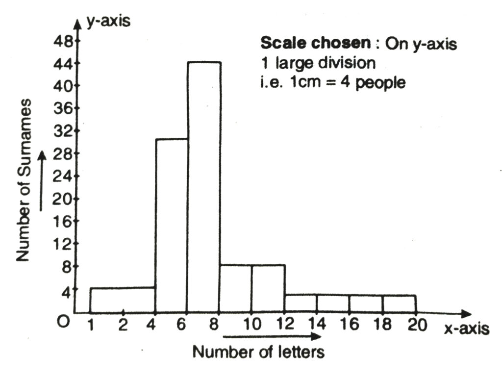
Q. 9. 100 surnames were randomly picked up from a local telephone directory and a frequency distribution of the number of letters in the English alphabet in the surnames was found as follows :
| Number of letters | Number of surnames |
| 1-4 | 6 |
| 4-6 | 30 |
| 6-8 | 44 |
| 8-12 | 16 |
| 12-20 | 4 |
(i) Draw a histogram to depict the given information.
(ii) Write the class interval in which the maximum number of surnames lie.
Solution.— Here classes are not of equal size. We select the class with minimum class size. Here minimum class size is 2.
Adjustment of frequency (height of rectangles) according to the class size are as follows :
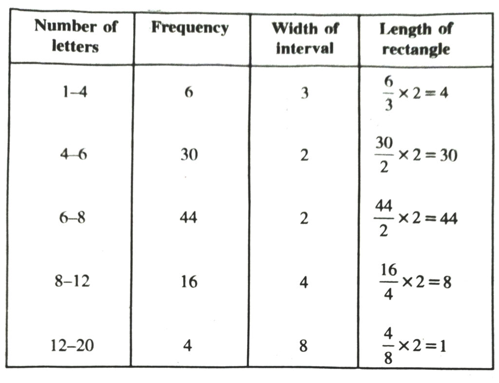
Now we draw the histogram using these lengths
CENTRAL TENDENCY
When a large population of data be given, then it becomes difficult to comprehend the data and so it is not helpful to draw any conclusion therefrom. Hence in order to represent their character, we need a quantity which may represent the data in the best possible way. The quantity which represents the entire set of data in the best possible way is called the statistical mean. The techniques of getting such a
representative value of the series of data are called measures of central tendency.
An expression which represents the entire data should neither be the lowest nor the highest value in the data; but it should lie somewhere between these two, possibly in the centre. That is why, these techniques are called measures of central tendency.
Commonly there are three measures of central tendency. They are (i) Arithmetic mean (or simply mean) (ii) Median (iii) Mode.
ARITHMETIC MEAN ARITHMETIC MEAN OF RAW DATA DEFINITION
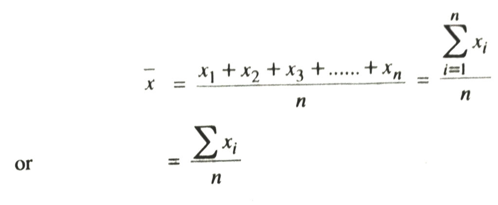
Let x1, x2, x3, …………, xn be n observations of the variate x. Then their arithmetic mean, denoted by x, is defined as
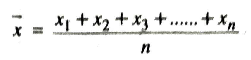
NOTE. What we call arithmetic mean in Statistics, is the average of numbers in Arithmetic.
In all subsequent discussions, it would be convenient to use a notation ‘∑’ (called sigma) to denote ‘the sum of similar terms’. Thus we can write
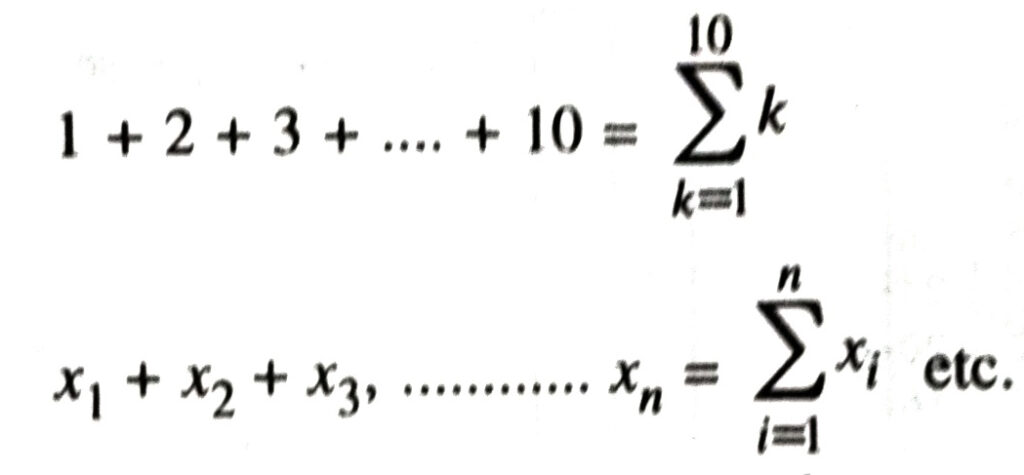
The lower limit below sigma i.e. i = 1 stands for the first term and the upper limit above sigma i.e. i = n stands for the nth term which is the last term. Where there is no room for any confusion, we can dispense with both the limits. Thus the formula for arithmetic mean can be rewritten as
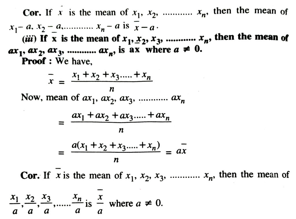
SOME RESULTS ON MEAN
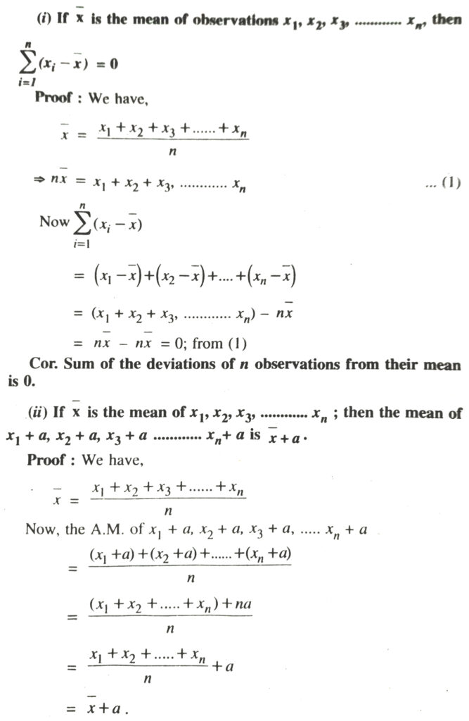
Example. If the mean of 8 observations be 15 and 2 be added to each observations, then the mean of new set of observations will be
15 + 2 = 17
ARITHMETIC MEAN OF UNGROUPED DATA (DISCRETE SERIES)
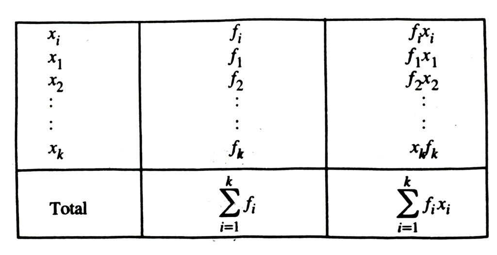
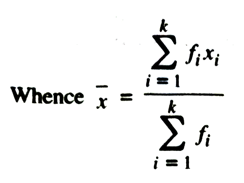
If the n observations in the raw data consist of only k distinct values denoted by x1 , x2, ……… xk of the observed variable x, occuring with frequencies f1 , f2 , ……… fk, respectively i.e. the raw data can be put in a frquency table of the from :
Table
MEDIAN DEFINITION
When the data are arranged either in ascending or descending order of magnitude, the value of the middle most observation is called the median of the data.
NOTE : Median, like arithmetic mean is also an average. When any two items of a given array of data differ by a large quantity, then mean is not an appropriate average to represent the data. In that case, median is a more appropriate average.
CALCULATION OF MEDIAN OF RAW DATA
Working Rule. We first arrange the data in an increasing or decreasing order. Let n be the total number of observations.
(i) If n be odd, then the value of 1/2 (n + 1) th term is the median.
(ii) When n is even, the data arranged in order of magnitude will have two middle-most values i.e. {n/2 + 1} th values, then
∴ Median = 1/2 {n/2 th value + {n/2 + 1} th value}
Mode. Mode is the average to be used to find the ideal size. For example in business, forecasting in the manufacturing of readymade garments.
Mode can be calculated graphically. Mode is the value which occurs most frequently in the set of observations.
Thus, mode of a frequency distribution is that value of the variable which has maximum frequency.
TEXT BOOK EXERCISE – 14.4
1. The following number of goals were scored by a team in a series of 10 matches :
2, 3, 4, 5, 0, 1, 3, 3, 4, 3
Find mean, median and of these scores.
Solution.— As we know that
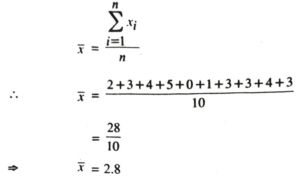
For median
Arrange the given data in the ascending order we get :
0, 1, 2, 3, 3, 3, 3, 4, 4, 5
Here n = 10, an even number
∴ Median Average of n/2 th and {n/2 + 1} th observation or average of 5th and 6th observation.
∴ Median = 3 + 3/2 = 6/3 = 3
For Mode
Make a frequency table for given observations we get :
| Goals | 0 | 1 | 2 | 3 | 4 | 5 |
| Frequency | 1 | 1 | 1 | 4 | 2 | 1 |
Here observation i.e. goal has the maximum frequency 4. Therefore mode = 3.
2. In a mathematics test given to 15 students, the following marks (out of 100) are recorded :
41, 39, 48, 52, 46, 62, 54, 40, 96, 52, 98, 40, 42, 52, 60
Find the mean, median and mode of this data.
Solution.— As we know that :
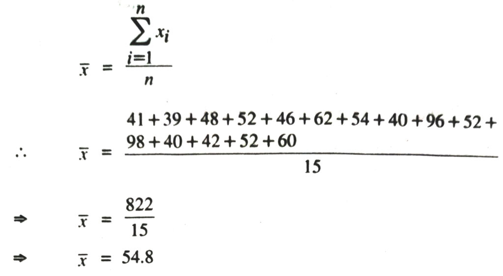
For median
Arrange the given data in the ascending order we get :
39, 40, 40, 41, 42, 46, 48, 52, 52, 52, 54, 60, 62.96, 98
Here n = 15, an odd number
∴ Median is at {n + 1/2} th observation or at {15 + 1/2} th observation or at 8th observation
So, median = 52
For Mode
Make a frequency table for given observations we get :
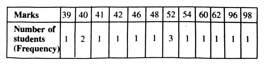
Here the marks 52 has the maximum frequency 3.
Therefore mode = 52.
3. The following observations have been arranged in the ascending order. If the median of the data is 63, find the value of x :
29, 32, 48, 50, x, x + 2, 72, 78, 84, 95
Solution.— The given data is in ascending order and here n = 10 an even number.
∴ Median Average of {n/2} th and {n/2 + 1} th observations i.e.
average of 5th and 6th observations
∴ Median = x + (x+2)/2
⇒ 63 = x + 1 [∴ median = 63 given]
⇒ x + 1 = 63
⇒ x = 62
4. Find the mode of the following data in each case :
(i) 14, 25, 14, 28, 18, 17, 18, 14, 23, 22, 14, 18
(ii) 7, 9, 12, 13, 7, 12, 15, 7, 12, 7, 25, 18, 7
Solution.—
(i) We have 14, 25, 14, 28, 18, 17, 18, 14, 23, 22, 14, 18
Making a frequency table, we have
| xi | 14 | 17 | 18 | 22 | 23 | 25 | 28 |
| fi | 4 | 1 | 3 | 1 | 1 | 1 | 1 |
Here the observation 14 has the maximum frequency 4.
Therefore, mode = 14
(ii) 7, 9, 12, 13, 7, 12, 15, 7, 12, 7, 25, 18, 7
Making a frequency table, we have
| xi | 7 | 9 | 12 | 13 | 15 | 18 | 25 |
| fi | 5 | 1 | 3 | 1 | 1 | 1 | 1 |
Here the observation 7 has the maximum frequency 5
Therefore, mode = 7
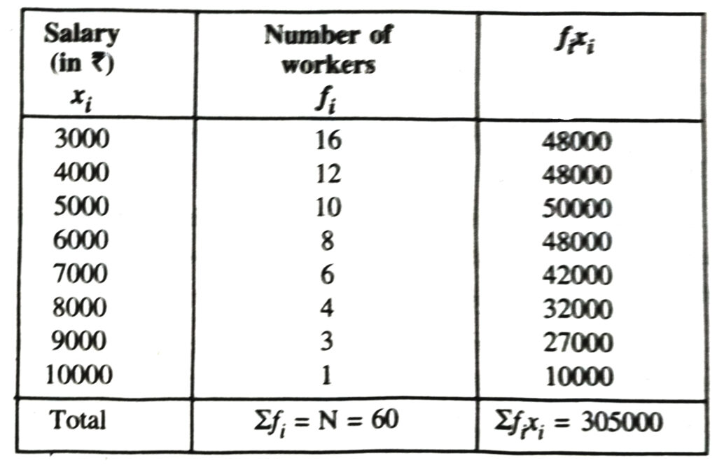
5. Find the mean salary of 60 workers of a factory from the following table :
| Salary (in ₹) | Number of workers |
| 3000 | 16 |
| 4000 | 12 |
| 5000 | 10 |
| 6000 | 8 |
| 7000 | 6 |
| 8000 | 4 |
| 9000 | 3 |
| 10000 | 1 |
| Total | 60 |
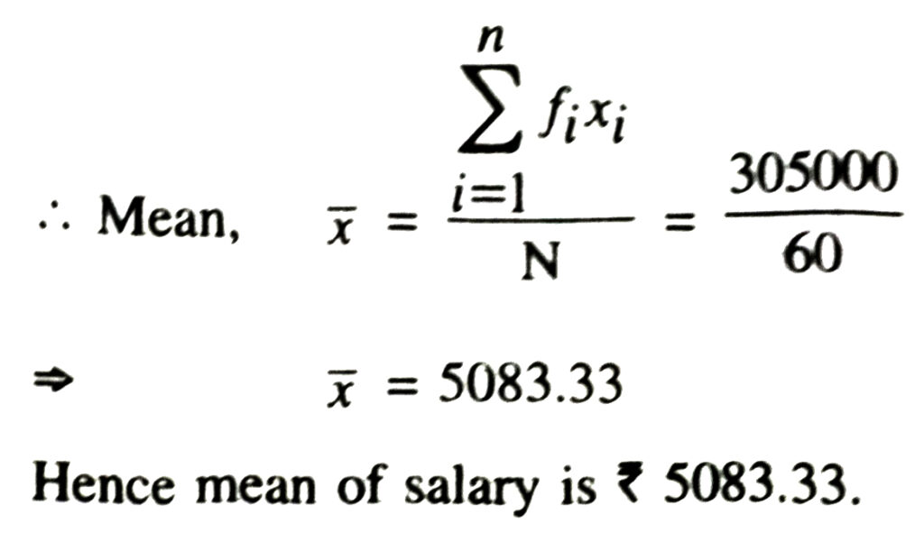
Solution.—
6. Give an example of a situation in which
(i) the mean is an appropriate measure of central tendency.
(ii) the mean is not an appropriate measure of central tendency but the median is an appropriate measure of central tendency.
Solution.— (i) Mean is the suitable measure of central tendency because every term is taken in calculation, it is effected by every item. It can further be subjected to algebraic treatment unlike other measures i.e. median and mode. As mean is rigidly defined, it is mostly used for comparing the various issues.
For example the marks obtained by the seven students are 10, 14, 18, 26, 24, 20, 14 and 27
The mean = 10+15+14+18+26+24+20+14+27/9
= 168/9 = 18.67
But median of 10, 14, 14, 15, 18, 20, 24, 26 and 27 is 18 and mode is 14.
From above example we conclude that mean is rigidly defined and the marks 18.67 represent the performance of 9 students, but median and mode are not so rigidly defined.
(ii) (a) Mean is much affected by the extreme value but median is not much affected by these extremes.
For example if there are 5 terms;
4, 7, 12, 18, 19.
Mean (X) is 12 in this case and median is 12.
If we add two values 450 and 1000 the new mean
4 + 7 + 12 + 18 + 19 + 450 + 1000/7
= 1510/7 = 215.7
This is a big change as compared to the size of first five term’s mean but new median of
4, 7, 12, 18, 19, 450, 1000
is 18 which is not so much changed as compared to the size of first five term’s median.
So, we conclude that the mean misrepresent the result if extreme values are present in the data.
(b) Sometimes mean gives impossible conclusion e.g. if there are 60, 50 and 42 students in three classes then mean number of students is 60 + 50 + 42/3 = 50.67, which is impossible as students cannot be in 3 is fractions.
But median of 42, 50 and 60 is 50.
Follow on Facebook page – Click Here
Google News join in – Click Here
Read More Asia News – Click Here
Read More Sports News – Click Here
Read More Crypto News – Click Here